CrowdXS
Modernizing an established identity without losing what made it recognizable.
CrowdXS is a technology company providing WiFi and fiber connectivity solutions to businesses in the Netherlands and Spain.
The company works with well known organizations including SiR Hotels, Sheraton and Pathé, as well as industry partners such as KPN and Ruckus.
When CrowdXS approached Eureka Creates, the company already had an established visual identity. The goal was not to create something completely new, but to modernize the existing logo while preserving the elements that customers already associated with the brand.
The Eureka Creates team was brought in to find the right balance between evolution and recognition, giving the brand a more contemporary presence without losing its existing identity.
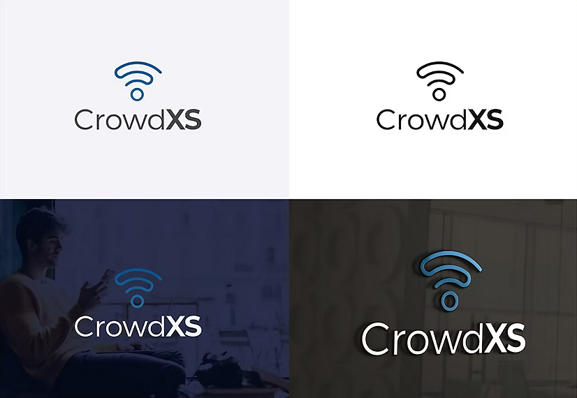
Modernizing the brand without making it feel like a different company.
CrowdXS had been considering a logo redesign for some time, but finding a branding and design partner that understood exactly what the founders wanted had proven difficult.
The founders still connected with their existing identity and particularly wanted to preserve the WiFi symbol that had become an important and recognizable part of the CrowdXS brand.
The challenge was not simply designing a new logo. It was understanding what should change, what should stay and how to create a more modern and professional visual identity while maintaining the recognition the company had already built.
Evolvingwhat alreadyworked.
The Eureka Creates team started by understanding CrowdXS, its technology services, B2B audience and what the founders valued about the existing brand identity. Danny Martins, our Founder and Strategy Director, worked with the team to define a creative direction focused on evolution rather than reinvention. As an Amsterdam based branding and design partner, Eureka Creates developed three logo concepts, each exploring a different approach to the redesign while maintaining a clear connection to the original identity. The WiFi symbol remained central, while typography, composition and visual details were refined for a cleaner, more contemporary appearance. This gave the founders different creative directions to consider while ensuring the final identity still felt unmistakably like CrowdXS.
- Logo Redesign
- Brand Identity Development
- Brand Refresh
- Visual Design
- Creative Direction
- Concept Development
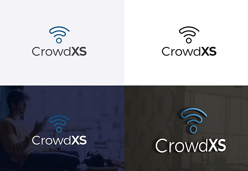
A familiar identity with a more modern presence.
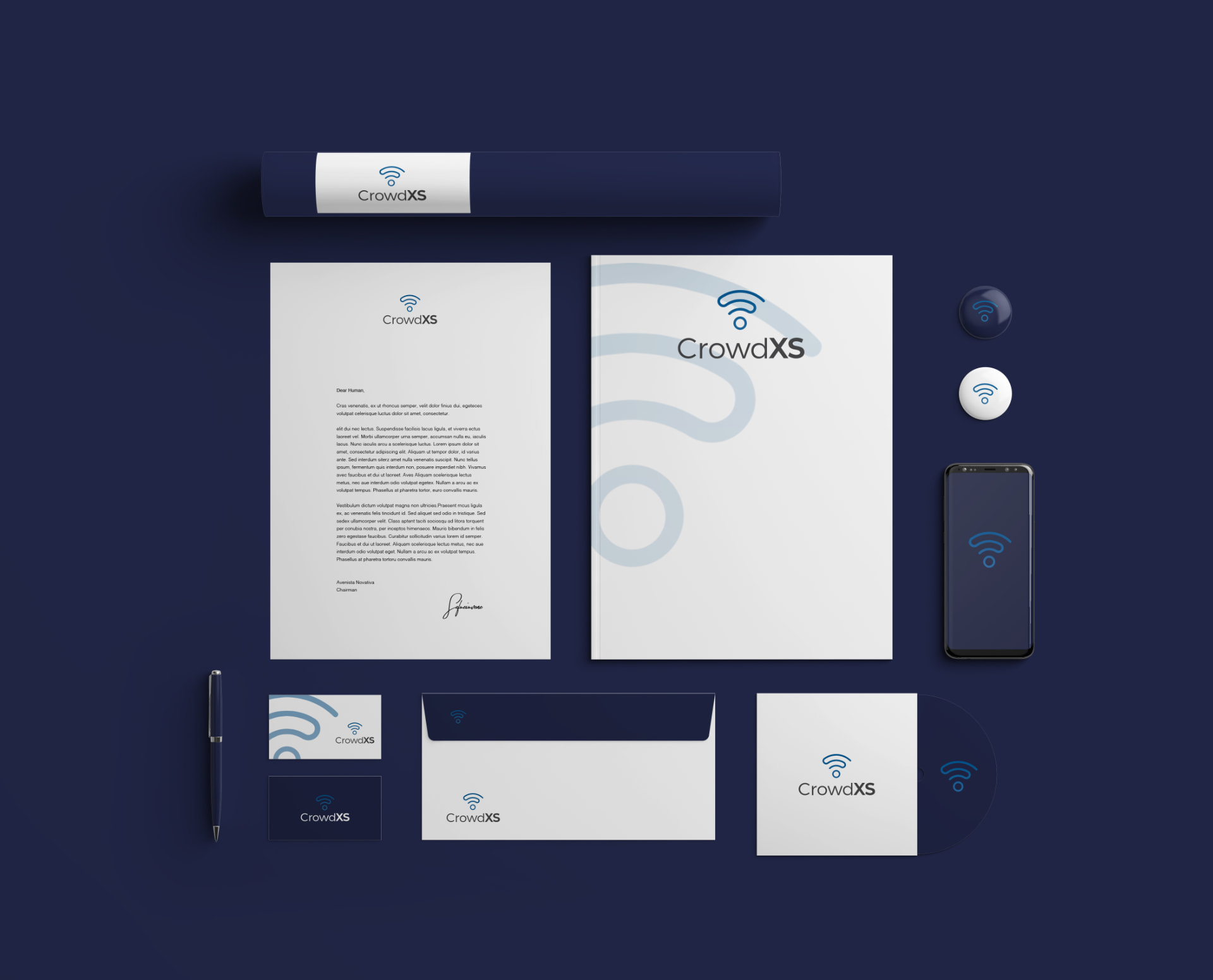
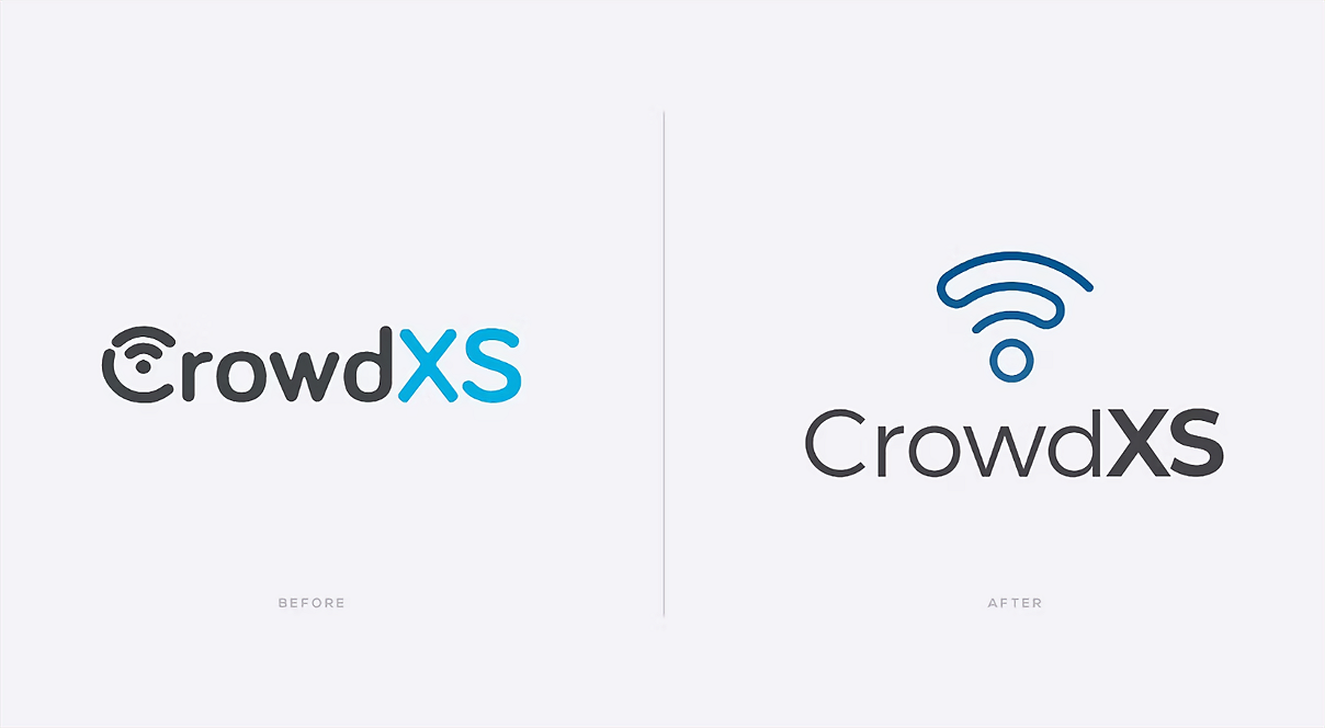
The founders selected the logo design that best represented how they wanted CrowdXS to move forward. The redesigned identity has since been implemented across the company's digital presence, including its website, creating a more modern, professional and trustworthy appearance while maintaining the recognizable elements of the original brand. Rather than replacing what already worked, the brand refresh gave CrowdXS an updated visual foundation that better reflects the established technology company it is today.
MODERNIZED IDENTITY
A refreshed logo and visual identity that give CrowdXS a cleaner and more contemporary presence.
BRAND RECOGNITION PRESERVED
The familiar WiFi symbol remained at the heart of the logo design, maintaining continuity with the existing brand.
DESIGNED AROUND THE BUSINESS
A brand refresh shaped around CrowdXS, its audience and its goals rather than changing the identity for the sake of change.
“Danny and the team were very professional and we were very happy with the end result. I had already been looking for a company that was able to redesign our logo for a while, but none really understood what we wanted. Luckily, I found Eureka and they delivered exactly what I was looking for. Thank you for that!”
Let’s start with a conversation.
We’d love to learn more about your business, your challenges and what you want to achieve. Book a time that works for you and let’s explore what’s possible together.